Why Some iPhone Calls Have No Decline Button, And What It Teaches Us About the Future of AI
You have seen it happen. The phone rings, you look down, and the screen offers you two choices: send a message, or be reminded later. There is no red button. No way to simply say "no." Then, twenty minutes later, another call comes in and there it is, a clear, honest decline option sitting right where it should be. Same phone. Same person calling. Different buttons.
People notice this. They post about it. They assume it is a bug, or a setting they accidentally turned on, or some hidden feature buried three menus deep. It is none of those things. It is a design decision, a small, deliberate piece of logic that decides what you are allowed to do based on what your phone thinks is happening around you.
And that decision-making pattern is exactly what is about to run the rest of your software. Understanding why that red button sometimes disappears is one of the clearest windows you will get into how AI-powered products will behave in the next few years.
The short answer: your phone is reading the situation, not just the call
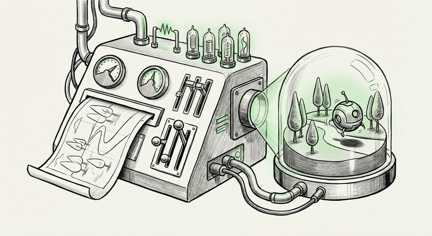
Most people assume the incoming call screen is a fixed menu. It is not. It is closer to a small decision engine that runs the moment a call arrives. It checks a handful of conditions, is the screen locked, is another call already in progress, is this call arriving on this device or being passed along from another one, is a focus mode active, and then builds a button layout that fits that specific situation.
When the answer comes back "the person is not actively using the phone," the interface shifts toward softer options. When the answer comes back "the person is holding the phone and looking at it," the direct option appears. The phone is not withholding a feature. It is making a judgment about context and adjusting the offered choices to match.
This is why two people can describe the same phone differently and both be right. It is also why advice found online often fails, the person giving the advice and the person following it are in different states, so they see different screens.
The three situations that change the buttons you see
In practice, the variation almost always comes down to one of three conditions.
1. The phone is locked versus unlocked
This is the most common trigger. On a locked screen, the design leans toward gentle deflection: silence the ring, reply with a quick text, get a reminder to call back. The thinking is that a locked phone means a distracted person, and a distracted person is more likely to decline by accident and regret it. Unlock the phone, and the assumption flips, you are engaged, you can make a real choice, so the real choice is offered.
2. A call is already in progress
When a second call arrives on top of an active one, the interface is juggling three relationships at once: the person you are talking to, the person trying to reach you, and you. The options change to reflect that triangle. Declining here is not just "no", it means something to the caller on hold, and the design tends to reflect that added weight.
3. The call is arriving from somewhere else
Calls can ring on more than one device, and calls can be handed off between devices. When a call reaches you through a relay rather than directly, the available actions can differ, because the device handling the audio is not necessarily the device showing the buttons. That mismatch is one of the most confusing versions of the problem, and it is the one most likely to be mistaken for a glitch.
A fourth factor worth knowing about
Focus modes and silencing settings also reshape the incoming call experience. They do not always remove the decline option, but they change which actions are promoted, muted, or tucked away. If your buttons look strange and none of the above applies, this is the next place to look.
Why a designer would ever hide the "no" button
On its face, removing a decline option sounds controlling. In practice, the intent behind this family of design choices is usually protective. An accidental decline can be socially costly, you have told someone, wordlessly and permanently, that you did not want to talk to them. That is a hard thing to take back. Softening the options when the user seems distracted reduces the chance of an irreversible mistake.
That is the generous reading, and it is probably the honest one. But it comes with a cost that is worth naming plainly: the interface took a decision away and did not announce that it had. The user did not choose to lose the option. They simply found it missing and had no explanation.
That trade-off, protection versus transparency, is the single most important thing to carry forward from this story. Because the systems making these calls are about to become far more capable, and far less visible.
This is exactly how AI is going to behave
A modern AI assistant is, at its core, a context engine that decides what to offer you. Every time it drafts an email instead of asking you to write one, every time it auto-fills a form field, every time it hides a setting it thinks you do not need, it is running the same logic as that incoming call screen. It reads the situation, forms a judgment, and presents a narrowed set of choices.
Three shifts are turning this from a curiosity into a core business concern.
From static menus to dynamic ones
Software used to show everyone the same screen. AI-driven interfaces increasingly show each user a different screen, shaped by their history, their current task, and their apparent state. The upside is a product that feels intuitive. The downside is that no two users can compare notes, and support teams cannot rely on "what do you see on your screen?" as a diagnostic question.
From features to judgments
Hiding a button is a judgment call. So is auto-approving an expense, auto-routing a support ticket, or auto-rejecting a lead. As AI takes over more of these micro-decisions, the interesting question stops being "does the model work?" and becomes "when the model is wrong, can the human tell?" A missing decline button is annoying. A missing decline button on a loan application is something else entirely.
From interfaces to agents
The next wave goes further. Instead of shaping the options you see, AI agents will simply take the actions, booking, buying, replying, scheduling, and report back afterward. That is a huge gain in convenience. It is also the same design pattern pushed to its limit: the system decides what is appropriate in context, and you find out later.
What businesses should take away from a missing button
The lesson here is not "never hide options." Restraint is often good design. The lesson is that contextual automation creates an invisible contract with users, and that contract has to be written down.
When your product makes a judgment on the user's behalf, four things need to be true:
- The judgment should be explainable in one sentence. "We hid this because your phone was locked" is a sentence. "The model decided" is not.
- The user should be able to override it without hunting. If the full set of choices exists, there should be a reliable path to it, not a hidden gesture or a forum post.
- The absence should be visible. A missing option and an option that never existed look identical to a user. Good systems make the difference clear.
- The pattern should be consistent enough to learn. Users build mental models fast. If the interface behaves differently every time without a rule they can perceive, trust erodes quietly and permanently.
The risk nobody budgets for: silent loss of control
There is a well-documented pattern in how people respond to automation. When a system is right most of the time, people stop checking. When it is wrong, they are out of practice. The incoming call screen is a mild version of this. You ring, you reach for the red button, it is not there, and for two seconds you are fumbling with a device you have used for years.
Scale that to business processes, approvals, refunds, hiring screens, medical triage prompts, and the two-second fumble becomes a real operational risk. Not because the AI is bad, but because the human's ability to intervene has been quietly degraded by good design.
The organizations that handle this well will be the ones that treat optionality as a product metric. Not just "did the task complete?" but "could the user have stopped it?" and "would they have known how?"
Actionable steps for teams building with AI right now
- Audit your "no decline button" moments. Map every place your product makes a choice on the user's behalf. Rank them by how hard they are to reverse. Fix the top three.
- Log the reasoning, not just the outcome. When an AI system narrows or changes what a user can do, store why. You cannot explain a decision you did not record.
- Keep a consistent escape hatch. One predictable way to reach the full set of options beats five clever ones nobody discovers.
- Test for confusion, not just completion. Watch new users try to do the thing that is missing. Friction there is a signal, not a user error.
- Design for the moment of refusal. Some of the most important interactions in any product are people saying no. Make "no" easy, obvious, and reversible.
The bigger picture
The reason this small inconsistency spreads so widely as a complaint is that it violates something people feel strongly about without being able to name: my device should not decide what I am allowed to do without telling me.
Every AI product now being built is walking into that same expectation. The technology will keep getting better at reading context. The hard part will not be the reading. It will be the telling, building systems confident enough to make judgments and honest enough to show their work, and leaving a clear door open for the person on the other side to say no.
A red button that sometimes disappears is a small thing. The habit of mind it represents, deciding for people quietly, for their own good, is not small at all. The companies that get this right will earn something more durable than engagement. They will earn the willingness of users to keep trusting them when the buttons change again.